Content Resource Libraries is currently a pilot feature. Contact us to learn more and request access.
- 📚 Create themed collections to organize resources (e.g., “Getting Started”, “Best Practices”)
- 🔗 Add links to external content like articles, videos, and tools
- 📅 Link past calendar events and recordings as resources
- 🏷️ Tag resources for easy filtering and discovery
- 🌐 Surface resource libraries on your companion site for members to browse and search
Key Concepts
Content Resource Libraries use a two-level hierarchy:- Collection — A named group of related resources. Each collection has a name, slug, optional description, and optional cover image. Collections are displayed as cards and can be reordered.
-
Resource — An individual content item within a collection. Each resource has a title, optional description, and optional cover image. Resources can be of the following types:
- External Link — A link to external content (articles, videos, documentation, tools, etc.)
- Event — A reference to a past Tightknit event, useful for linking recordings and recaps.
- Pages - internal pages within the companion site
- Embedded external pages - external pages embedded within the companion site
Managing Collections in the Studio
Viewing Collections
Navigate to the Content Collections page in the Studio. You’ll see a list of all your content collections, each displaying its cover image, name, description, slug, and resource count.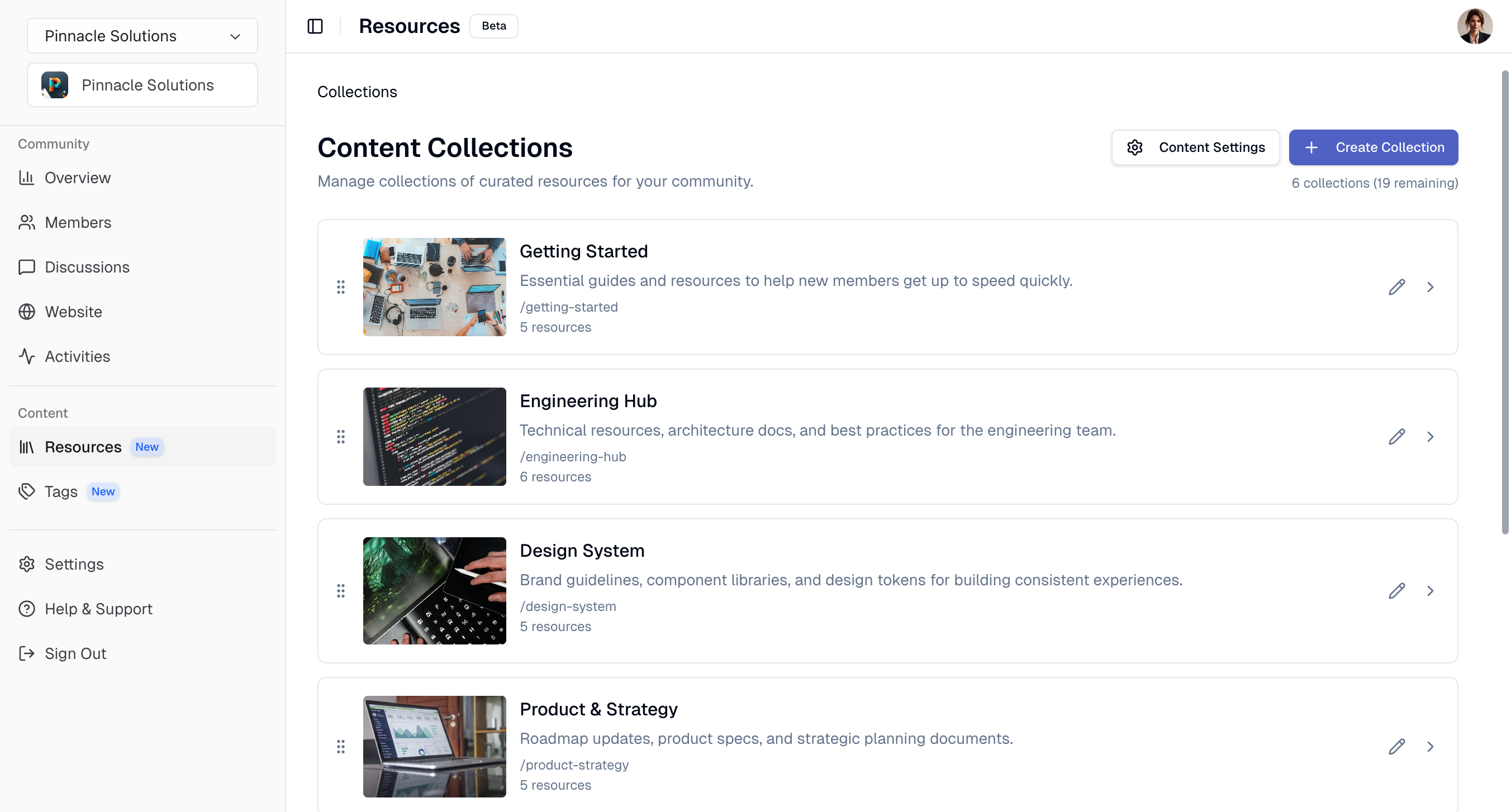
Creating a Collection
Click the Create Collection button to open the creation dialog. Fill in the following fields:- Name (required) — The display name for the collection (max 100 characters).
- Slug (optional) — A URL-friendly identifier for the collection. If not provided, one is auto-generated from the name. Must be unique and lowercase.
- Description (optional) — A brief summary of what the collection contains (max 500 characters).
- Cover Image (optional) — An image displayed on the collection card. You can upload an image file via drag-and-drop or paste an image URL. Recommended 16:9 aspect ratio with dimensions of 1280 x 720 px.
- Tag Groups (optional) — Select which tag groups are available for tagging resources in this collection (max 5 tag groups per collection).
Reordering Collections
Drag and drop collections to rearrange their display order.Managing Resources
Viewing Resources
Click on a collection card to open its detail page. Here you’ll see all resources within the collection, along with collection metadata like its slug, cover image, and associated tag groups. Click any resource title or the info icon to open its dedicated detail page.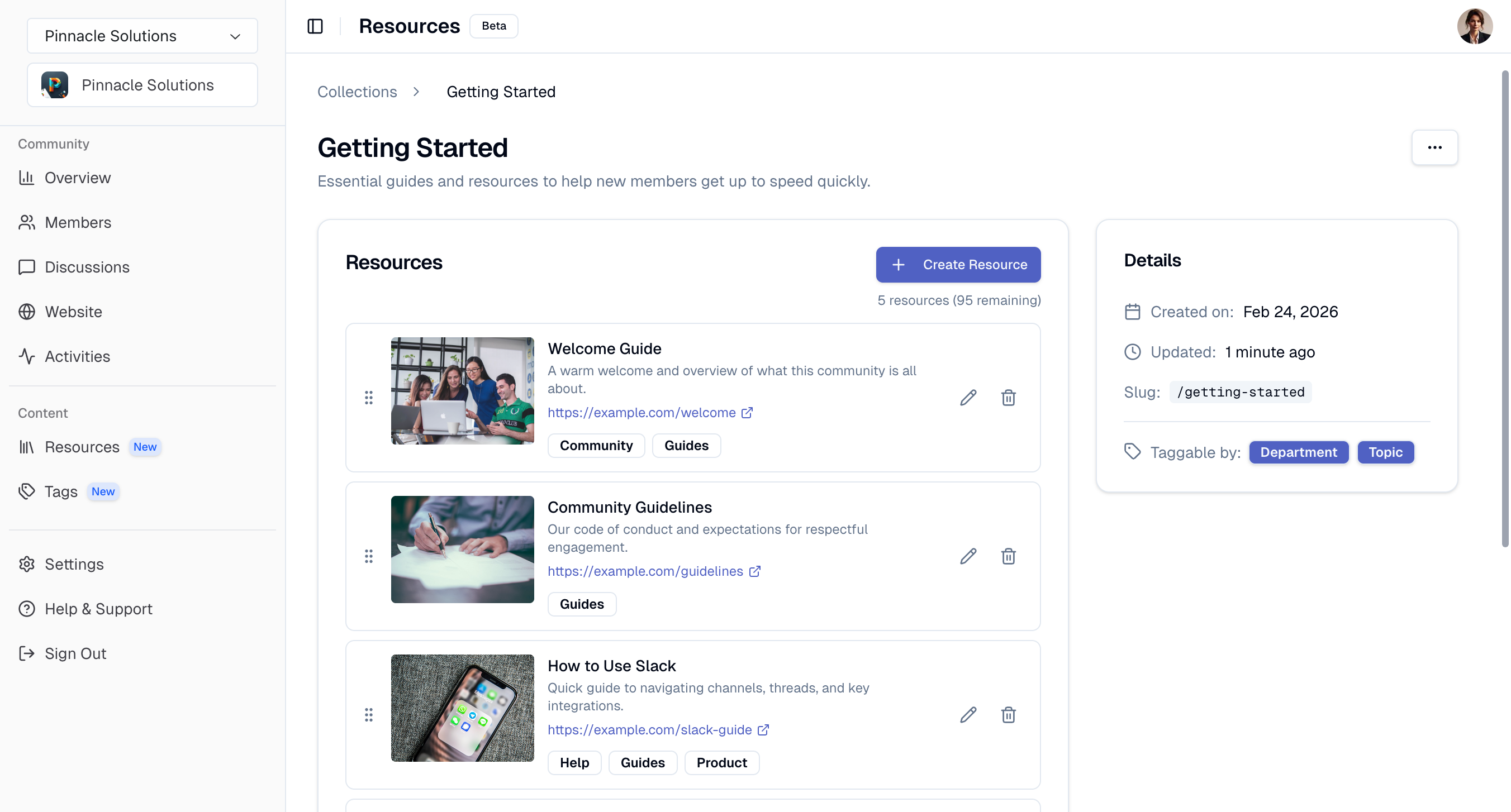
Creating a Resource
Click the Create Resource button within a collection to add a new resource. You can also create a resource from anywhere in the Studio via the Cmd+K global action, which lets you pick the target collection from a dropdown. Choose the resource type:- External Link
- Event
- URL (required) — The link to the external content.
- Title (required) — A display title for the resource (max 200 characters).
- Description (optional) — A brief summary (max 500 characters).
- Cover Image (optional) — An image displayed on the resource card. You can upload an image file via drag-and-drop or paste an image URL. Recommended 16:9 aspect ratio with dimensions of 1280 x 720 px.
- Tags (optional) — Select tags from the collection’s associated tag groups.
Resource Detail Page
Each resource has its own detail page at/~/resources/{resourceId} showing the type, URL or event date, cover image, tags, parent collection, and authorship metadata. You can edit or delete the resource directly from this page.
Editing & Deleting Resources
Click the edit button on any resource card to update its details, or the delete button to remove it. For Event resources, you can change the linked event. Deleting a collection detaches any resources in it rather than deleting them. Detached (orphan) resources remain accessible via their detail page and can be reassigned later.Reordering Resources
Drag and drop resources to rearrange their display order within the collection.Companion Site Display
To manage the visibility of Content Collections on the companion site, click the Content Settings button on the Content Collections page in the Studio. In the Content Settings dialog, you can configure:- Show on companion site — toggle to enable or disable the Resources and Collections routes on the companion site
- Resource library banner — an image displayed at the top of the Resources page on the companion site. Only available when your community has a companion site. For the best results, use an image with dimensions of at least 827 x 192 px. Very tall images may be clipped. Create with Canva template →
Resources Page
The Resources page (/resources) is a unified page that shows two sections:
- Collections carousel — A horizontal carousel of collection cards at the top of the page, ordered by position. A View All link in the top-right always navigates to the full collections list at
/collections. - All Resources — Below the carousel, all resources across every collection are displayed alphabetically in an infinite-scrolling feed. Members can toggle between a list view and a grid view from the top-right; the preference is persisted across visits.
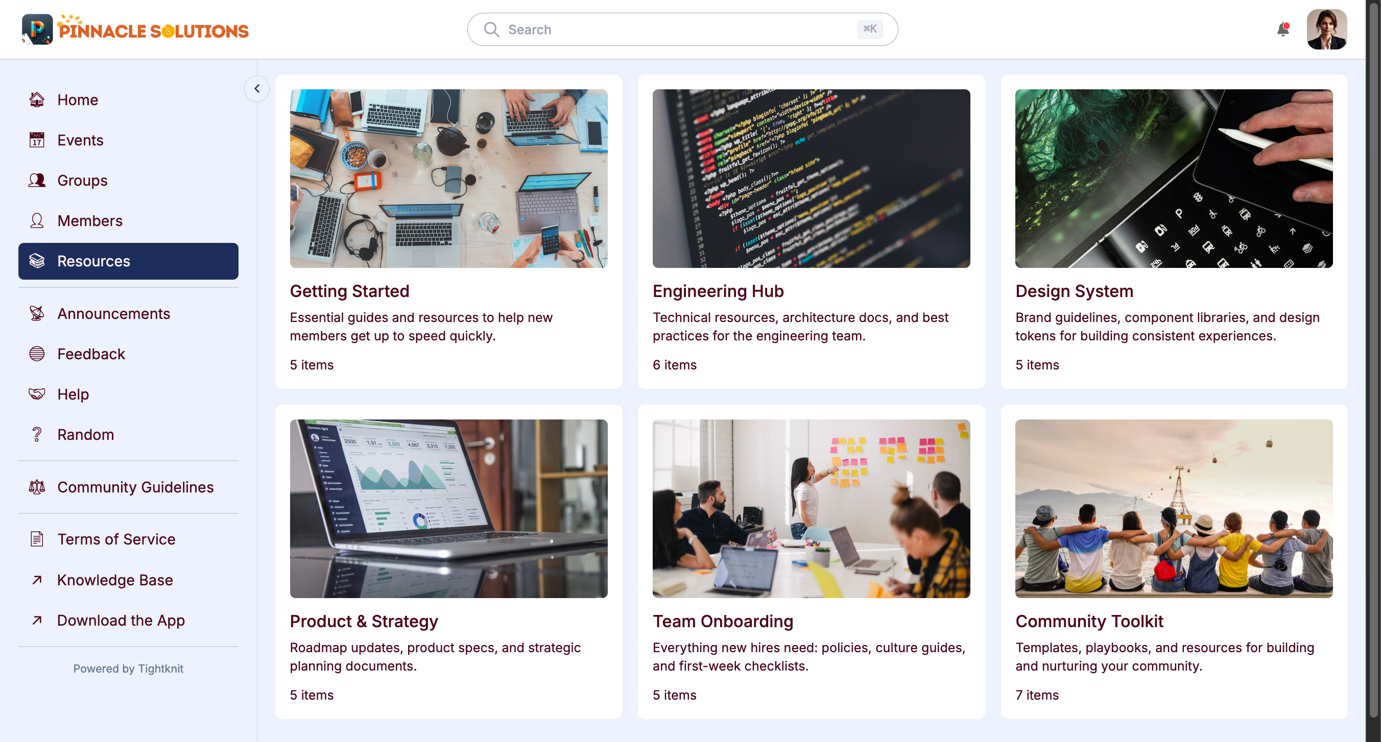
Collections Page
The collections page (/collections) displays all collections as a responsive grid of cards. Each card shows the collection’s cover image, name, description, and resource count. Clicking a card opens the collection detail page.
Collection Detail Page
The collection detail page (/collections/{slug}) shows all resources in the collection as an infinite-scrolling grid of cards. Each resource card displays:
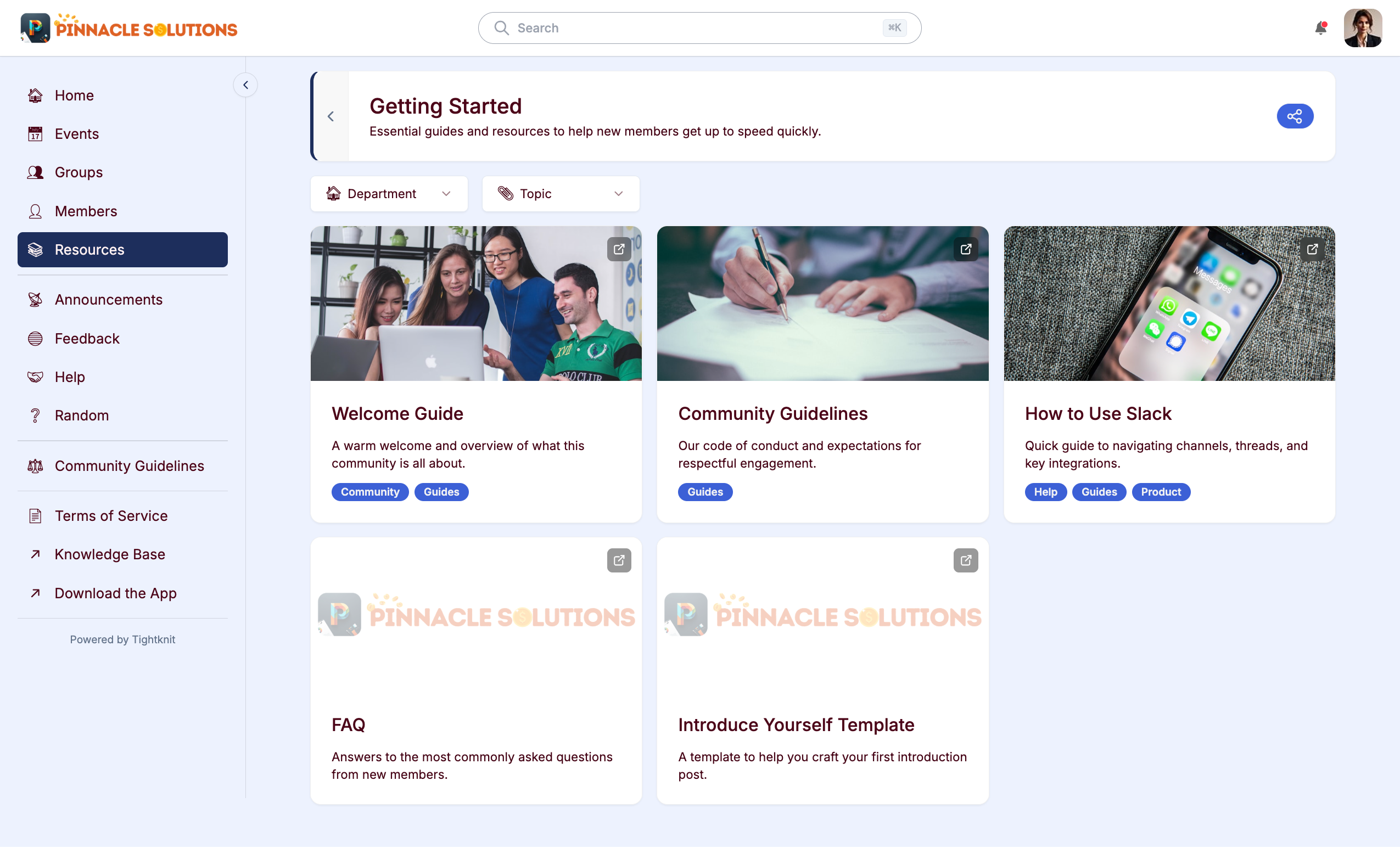
- Cover image (falls back to your community site logo if none is set)
- Title and description
- Tag badges
- For Event resources: the event date and a link to the event page
- For External Link resources: an external link icon. Clicking opens the URL in a new tab
Filtering by Tags
Tag filter dropdowns appear on both the Resources page (all resources section) and on individual collection detail pages when tag groups are configured. Members can filter resources by selecting one or more tags:- Within a tag group: filters use OR logic (matching any selected tag)
- Across tag groups: filters use AND logic (must match selections from all groups)