

Image Assets
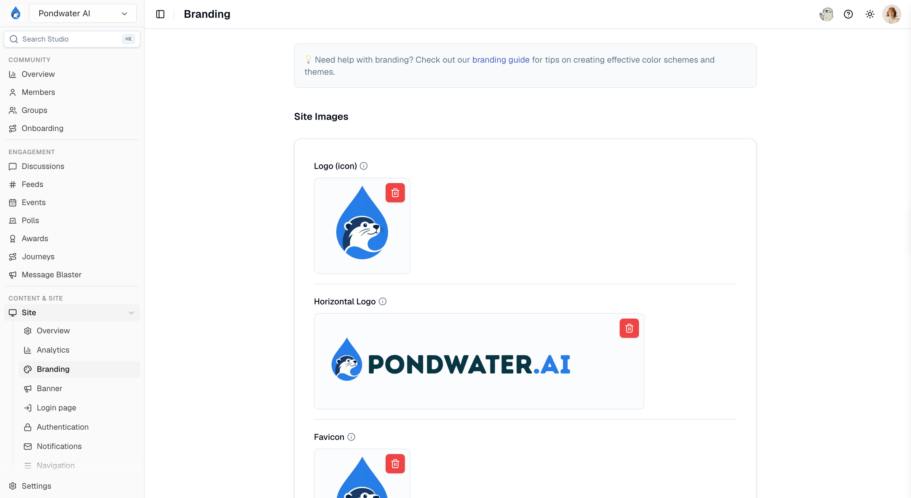
Site images on Site > Branding in Studio
Export at the recommended dimensions. They are deliberately larger than the
space the image appears in, because images are scaled down to fit their frame
but never scaled up. A smaller file looks soft on high-density (Retina)
displays, and the detail cannot be recovered afterwards.
Branding Sets
Branding sets live at Site > Branding in Studio. Click Create branding set to add one, or click an existing set to edit its colors, fonts, and shapes. A branding set is a collection of branding token values that work with our design system on the community site. You can access your branding sets in Studio under Site > Branding. You can have up to 4 branding sets, with only one configured as the active branding set for your community site.The Default Branding Set cannot be deleted.
Colors
| Name | Description | Visual Guide |
|---|---|---|
| Paragraph Text Color | The color of all non-header text | 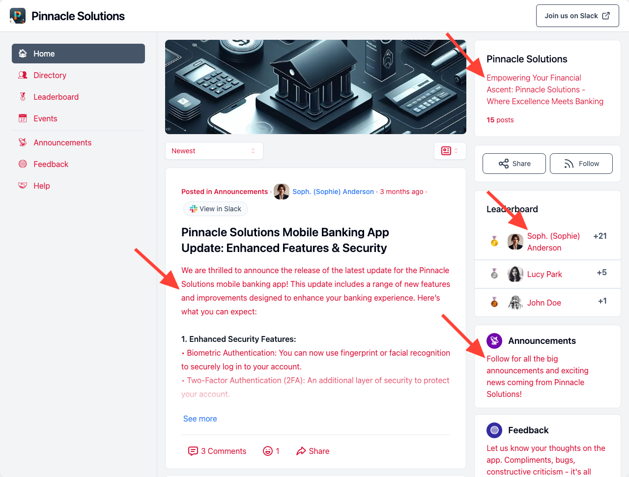 |
| Headline Text Color | The color of headline text, including: • the site name • section headers • card headers • post titles | 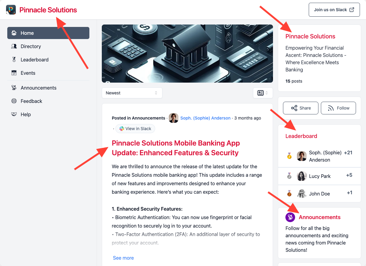 |
| Link Text Color | The color of certain anchor link text, including: • author profile links • event links | 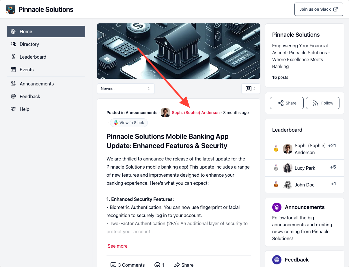 |
| Brand Color - Primary | The default color for primary buttons and certain other page elements, including • certain accent colors • profile badges • profile page backdrop |  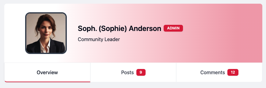 |
| Brand Foreground Color - Primary | The color of text within primary buttons and certain other page elements affected by Brand Color - Primary | |
| Brand Color - Secondary | The default color for secondary buttons and certain other page elements, including • pills | 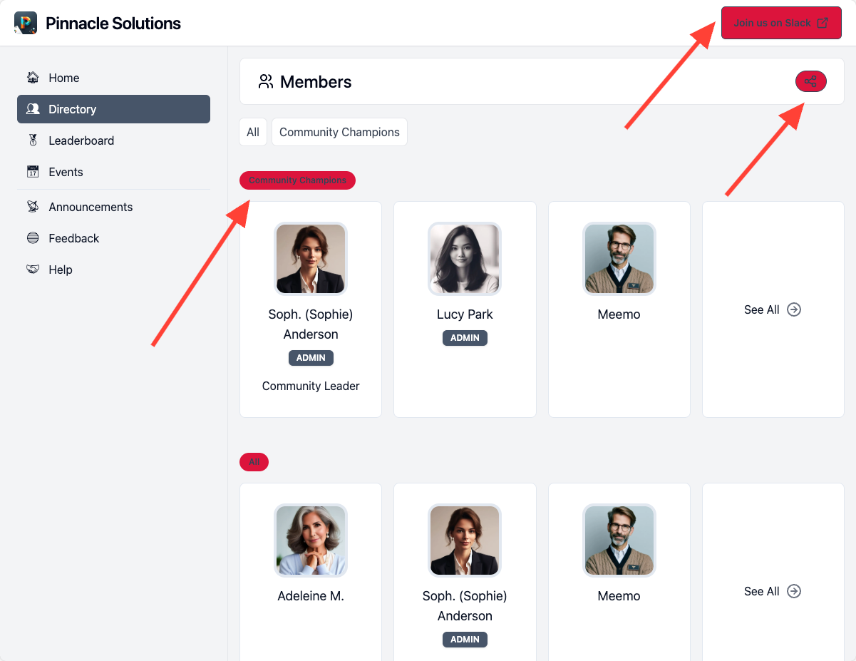 |
| Brand Foreground Color - Secondary | The color of text within primary buttons and certain other page elements affected by Brand Color - Secondary | 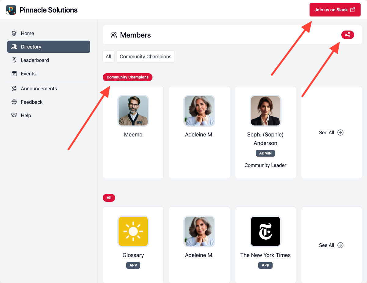 |
| Accent & Focus Color | The highlight ring drawn around whichever control is focused — the search box, form fields, buttons reached by keyboard. Leave it unset to follow Brand Color - Primary; set it when you want the focus state louder than your buttons. | Focus a field on your site (click into site search, or press Tab) and the ring around it is this color |
| Background Color | The background color of the pages | 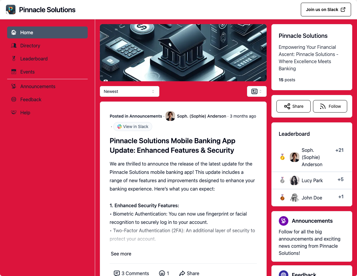 |
| Header Background Color | The background color of the top header bar containing site search and account actions | 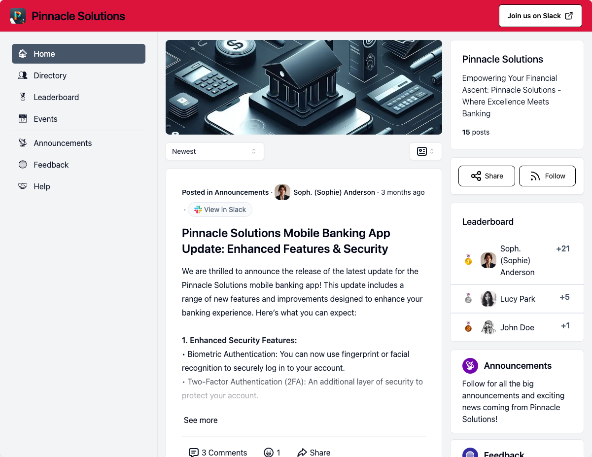 |
| Card Background Color | The background color of card sections, including: • info sections • feed posts • post detail pages • profile / event / feed list cards | 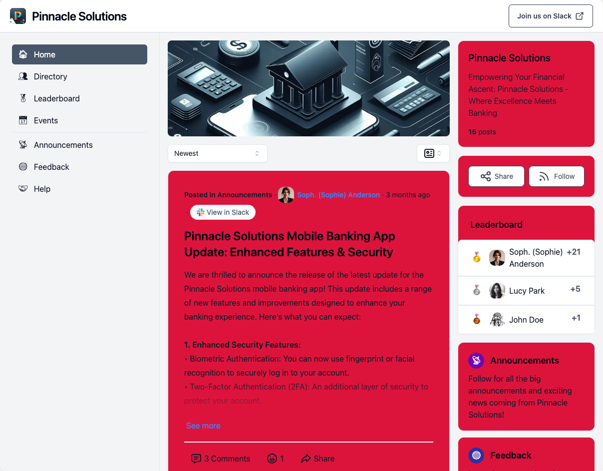 |
| Navigation Sidebar Background Color | The background color of the left navigation sidebar | 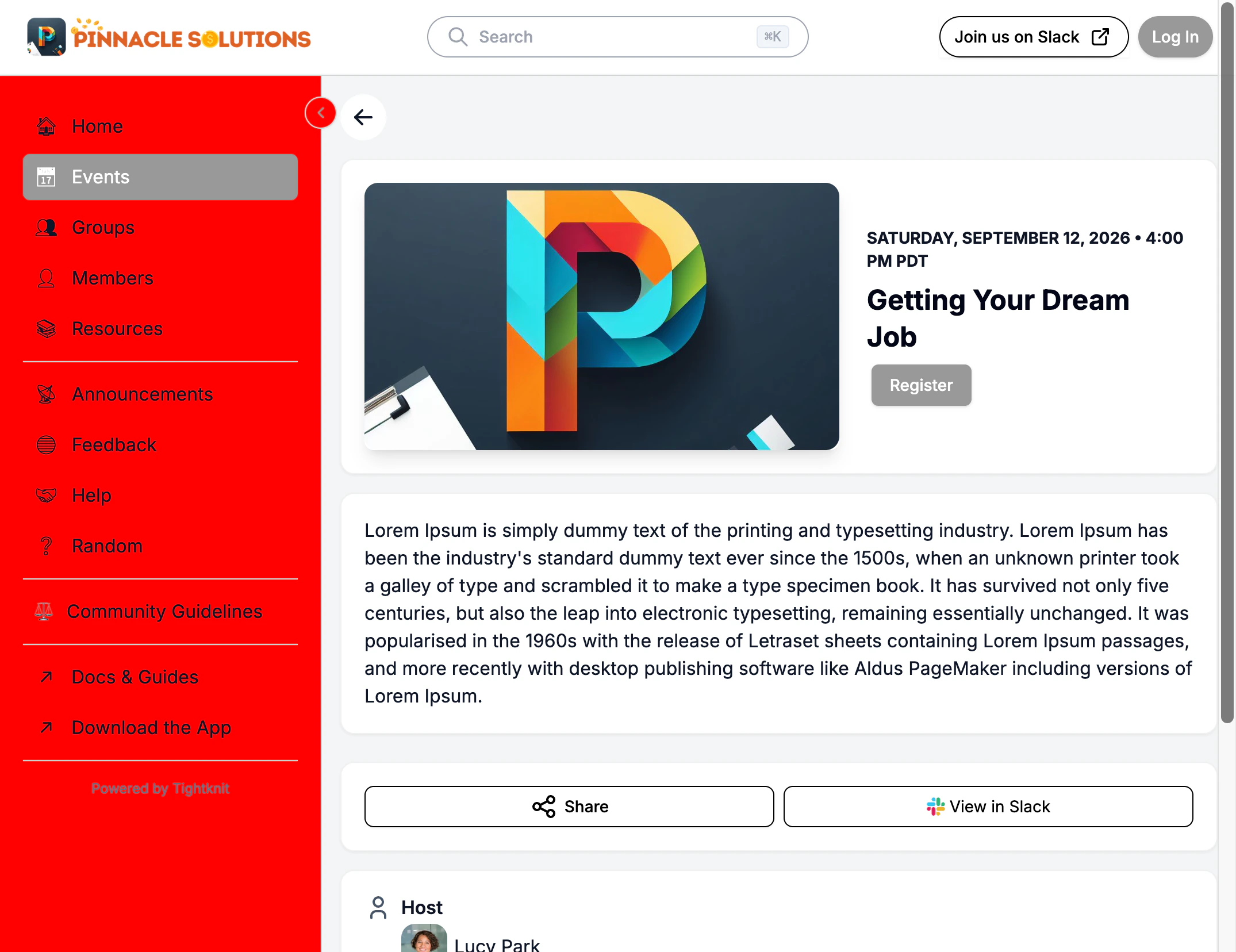 |
| Navigation Sidebar Text Color | The color of non-active nav item labels in the navigation sidebar | 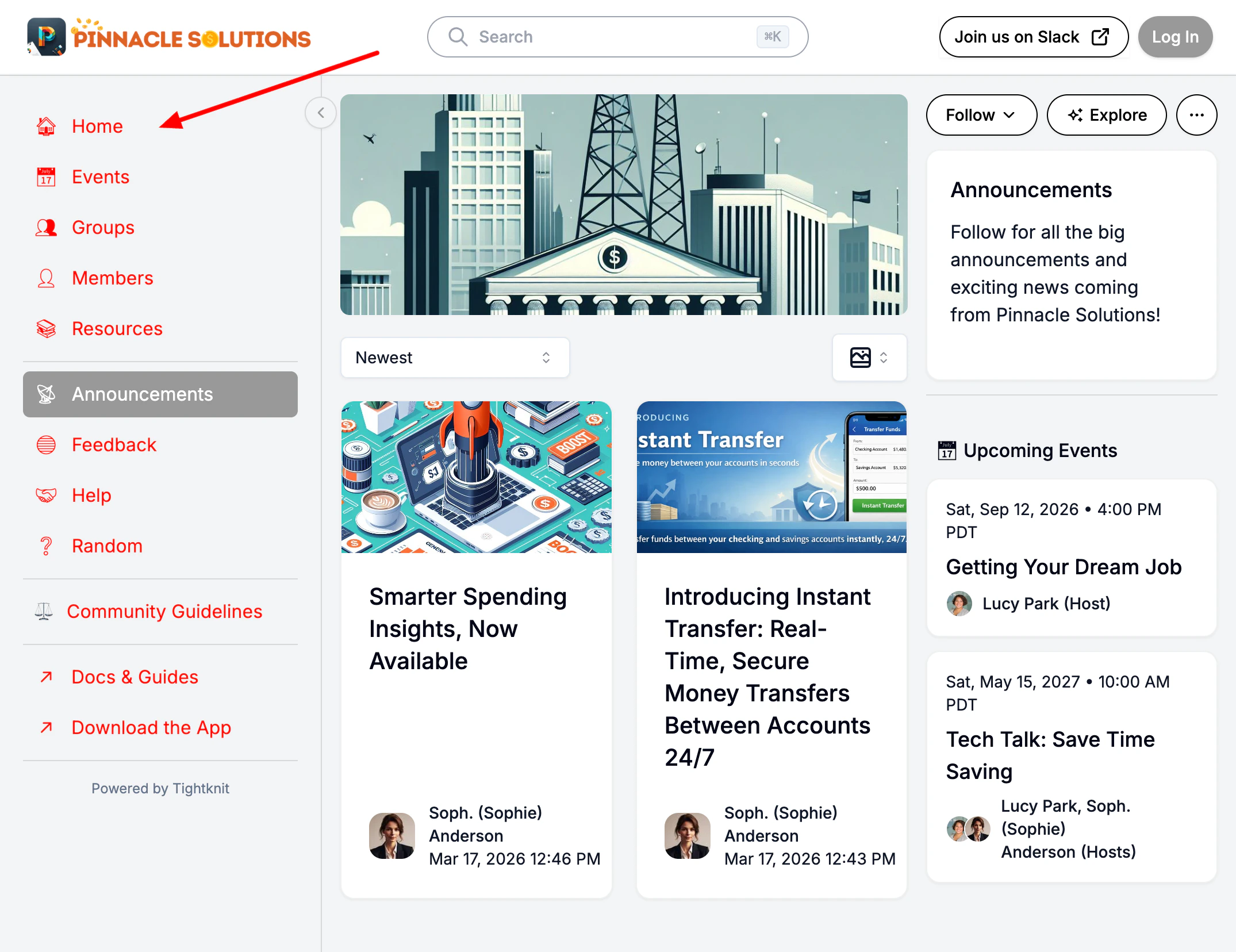 |
| Navigation Sidebar Active Item Background Color | The background color of the currently selected nav item in the sidebar. Also determines the hover color for nav items. | 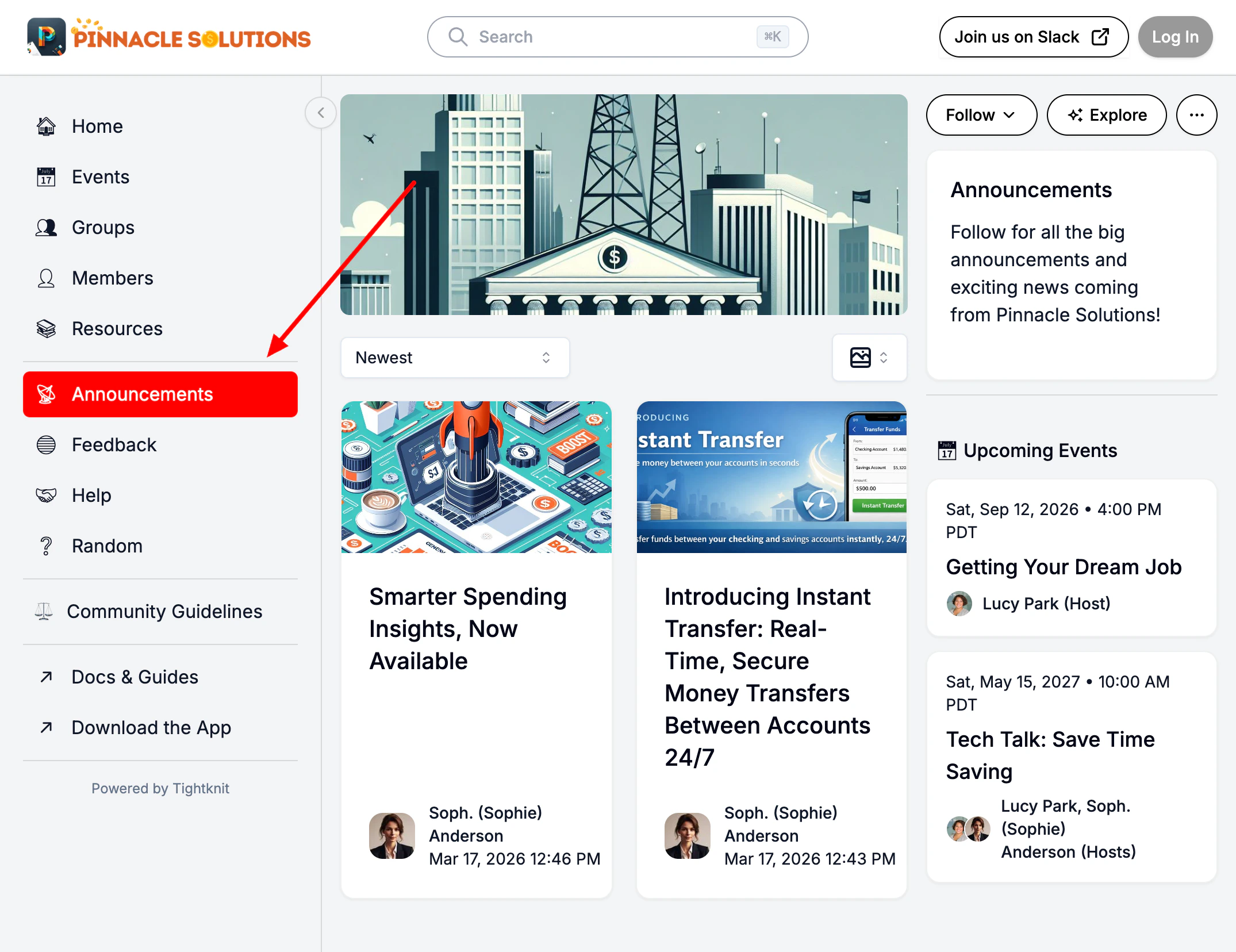 |
| Navigation Sidebar Active Item Text Color | The text color of the currently selected nav item in the sidebar | |
Color values must be a valid hex code in the format
#RRGGBBB.Colors you don’t set
Borders, separators, control outlines, hover fills, and secondary text are not in the list above, because they are derived from the colors that are. Each one is calculated from your card background or your paragraph color, so a monochrome palette produces monochrome chrome and a warm palette produces warm chrome, with no extra work. Two of them are adjusted automatically to stay legible:- The focus ring is lightened or darkened where needed so it stays visible against the surface behind it. A near-white accent on a white card would otherwise be invisible.
- Secondary text is held at a readable contrast against its background, even when de-emphasized.
Fonts
Each branding set picks two fonts: one for headings and one for body text. The heading font appears on page titles, post titles, card headers, and any element styled as a heading. The body font is used everywhere else. There are two sources to pick from, depending on your plan:Picking a font
In Studio, openSite → Branding, click into a branding set, and use the Header and Body dropdowns to pick the family for each. Each dropdown is set independently — the header defaults to Default (Inter) and can be changed to any catalog or custom family.
When you pick from the default catalog, the font loads automatically the next time the community site is requested. There is nothing else to configure.
Uploading custom fonts (Enterprise)
Custom font families are managed at Site > Branding > Fonts. In the same dropdown, chooseUpload a new font.... Drop one or more .woff or .woff2 files into the dialog. Each file gets a row showing a specimen rendered in the font itself, plus its weight (Regular, Bold, Light…) and style (normal or italic). A file with no Latin characters, such as a Cyrillic-only subset, shows no specimen and says why. The family name is read from the font file’s embedded metadata and pre-filled for you.
Every value the dialog fills in is a starting point you can change. Each row says where its weight and style came from: Weight & style auto-detected from the file’s embedded metadata, Weight & style inferred from filename when that metadata couldn’t be read, or Weight & style set by you once you change it yourself.
Turn on the license confirmation (you must own a license to embed the font on your site), then click Save font. The new family is immediately available in both the Header and Body dropdowns of the branding set you opened the dialog from.
What weights and styles should you upload?
Upload only the weights you actually want available. Browsers can fake bolder or lighter text by stretching the regular weight, but the result is visibly worse than a real font face for that weight.
The recommended set covers the weights our community site themes use for buttons, post titles, navigation, and body copy. Without 700, bold text falls back to a synthetic-bold of the regular face, which usually looks too heavy or jagged. Without an italic at the matching weight,
<em> text and styled quotes render as a synthetic skew of the upright glyphs, which doesn’t match a real italic design.
A family can only hold one file per weight and style. If more than one file lands on the same pair, the dialog flags every one of them and blocks saving until you change or remove the duplicates. The usual causes are alphabet subsets of the same font, or a variable font uploaded alongside a static face of the same weight.
Detection reads the weight from the font’s embedded metadata, which we accept only in whole steps of 100. A variable font, or one with unusual metadata, can come back with the wrong weight — check each row before saving and change it if it looks off. Setting a row to
Italic does not create an italic; upload the foundry’s italic file for that.Frequently asked
I uploaded a font but the site still shows the old one
I uploaded a font but the site still shows the old one
Community site pages are cached. The new font may take a minute to appear on already-loaded pages. A hard refresh (
Cmd-Shift-R on macOS, Ctrl-Shift-F5 on Windows) bypasses the cache immediately.Italic in my dropdown is locked. How do I make text italic?
Italic in my dropdown is locked. How do I make text italic?
The dropdown is locked because we read what your font file actually contains. If the file’s metadata says Regular (not italic), selecting Italic in the UI wouldn’t make text render in italic, it would just label the file incorrectly. To get true italic rendering, upload a separate file that is the italic variant of your font (for example,
MyFont-Italic.woff2), and the dialog will accept it as the italic face.What's the per-file size limit?
What's the per-file size limit?
2 MB per file. WOFF2 files for a single weight are typically well under that. If your file is larger, your foundry probably ships an unsubsetted version with full Unicode coverage. Most Latin-only websites can use a Latin-subset WOFF2 from your foundry’s site.
Can I have different fonts for different branding sets?
Can I have different fonts for different branding sets?
Yes. Each branding set has its own Header and Body picks. You can keep the default branding set on Inter, and a second branding set on a custom upload, then switch which is active depending on context.
What if my font isn't on Google Fonts and we don't own the file?
What if my font isn't on Google Fonts and we don't own the file?
You’ll need to source a licensed copy of the font files from your foundry, then upload them as a custom font (Enterprise plan). We can’t link to or embed third-party hosted fonts directly.
Shapes
Each branding set includes two shape controls that theme the entire community site. Both are configured in Studio under Site > Branding by clicking into a branding set. The event cover shape is not one of them: it is a community-wide event setting, documented under Global Event Settings.Corner roundedness
Controls how rounded buttons, cards, search inputs, and other UI surfaces appear across the site. Three presets are available:
The corner style cascades to every UI element on the community site. Changing it in one place updates buttons, cards, search bars, tabs, and all other surfaces at once.